My Thoughts on Miscellaneous Things
Case study: the long-term research behind Shopify Inbox
Business chat is still human
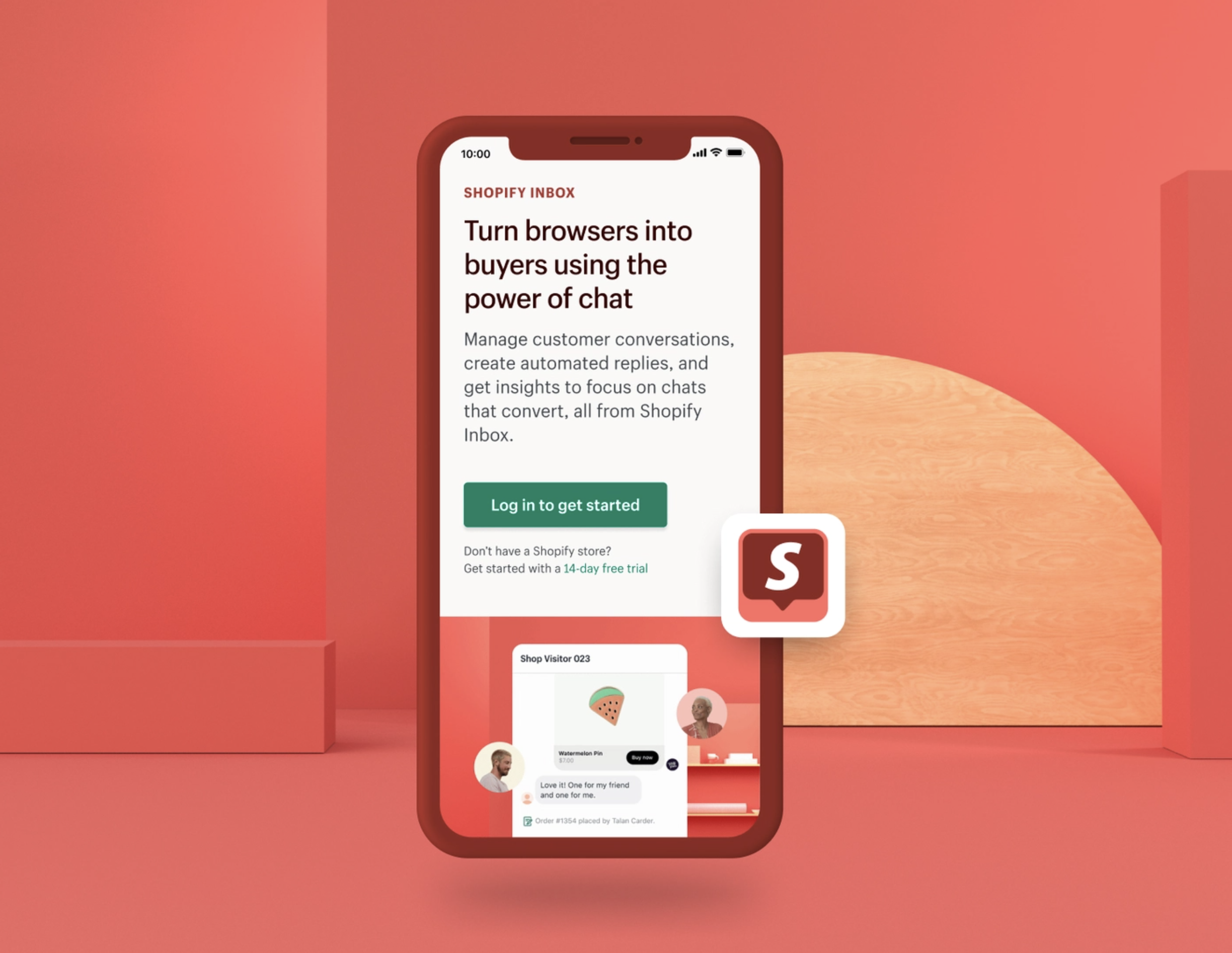
Research expands our understanding of a concept, and often plays the role of invisible scaffolding. I’ll walk through the outcomes of four studies that empowered the Shopify Messaging team to develop a strong point-of-view about what we think the future of conversational commerce may be for our merchants.
Video: How design teams redefined collaboration using Miro
Experience principles create consistency
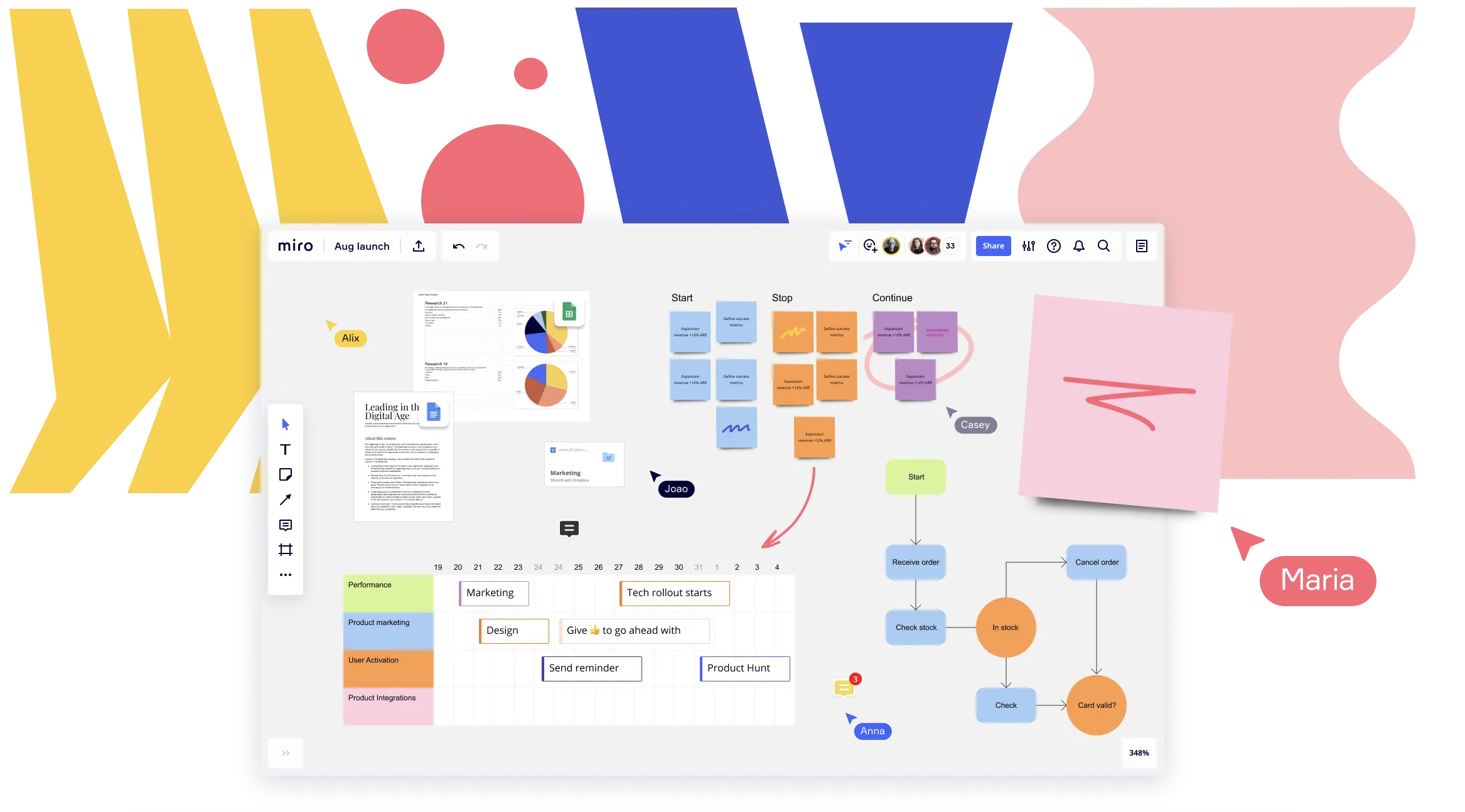
I presented alongside product and design experts from Miro, Shopify, Stack Overflow, and Founders Factory Africa to discuss how to use digital white-boarding tools to navigate remote and hybrid work environments, and to drive collaboration across distributed teams. I shared my own exercises and templates for establishing Experience Principles (and explained why they matter).
On Visual Ethnography, UX Writing Research and Inclusive Personas
Featuring Keren (Veisblatt) Toledano
USERWEEKLY is a weekly publication that helps people to understand what is happening in User Research globally. It stays abreast of trends, methodologies and insights in UX Research. Each week Jan Arend captures the pulse of our community and answer a simple question: What mattered in User Research this week? In this installment, discuss what Werner Herzog and my approach to UX Research have in common! 🎥
Defining the "Best" Way to Navigate Digital Spaces
Navigation is Exploration
People seek all sorts of information. They seek to find that information and then to navigate toward it. Sometimes it’s exploratory seeking, with no specific end goal. Sometimes it’s direct—to verify something or to buy a specific product. Sometimes it’s to reencounter a place they once were. A person is not static and so their goals change with context and need. As goals change, so, too, should the navigation tools employed.
The “Above the Fold Myth”
Not All Clicks: Why Scrolling Might Be Your Website’s Best Bet
Choosing which action to employ is not a simple task. The click vs. scroll decision will create a lot of implications for where your content lives, and the narrative you’re trying to tell. We’re here to help you understand what it really means when you choose a click over a scroll. Which is better? Which is more engaging? Let’s begin.
It’s Harder and Harder to Distinguish between Humans and Bots
SXSW 2020: How AI Poses Challenges to Authorship Today
This article is based on my experience with giving a Markov bot access to all of my Facebook posts since 2005 to write a series of poems mimicking my own voice. Markov bots infer the probability of a sequence, they are often used for automated pattern recognition, and speech is, of course, a grand pattern. It's essential that we work to define boundaries as technology and art progress. AI poses challenges to authorship as we conceive of it today.
The Origins of the Controversial Pop-Up Ad
In (Mild) Defense of the Pop-up
Whether one refers to the box as a pop-up, hover ad, modal, lightbox, popover, or an interstitial, the many named, often-square shaped overlay is a surviving vestigial tail of the early internet.
Heterarchies over Hierarchies, Spiderwebs over Trees
Object-Oriented UX, Part 1
In the physical world, we expect systems. Systems that create standards which help ameliorate confusion and lay out simple processes for people to follow. Systems that breed familiarity. Systems that establish relationships between things. Not just hierarchical, linear, parent-child relationships, but heterarchical, associative ones.
How you can put an object-oriented system into practice on your next project
Object-Oriented UX, Part 2
Let’s break down the steps in OOUXing. (Uh-oh, did we just turn an acronym made of nouns into a verb? For shame.) The articles outlines a broad summary of steps and smaller, tactical actions to be taken within each step.
Creativity Within Confines is a Good Thing
Breaking Through the Limits of Brand Style Guides
Just about every designer’s dealt with a brand style guide, an authoritative document that dictates how a brand should look, speak, and generally exist in all mediums.
Jargon-free Definitions of Common Agency Terms
Design Agency Glossary, Part 1
Do you know the ABCs of your RFPs and EPSs? Digital agencies, freelancers, and those in creative industries use all sorts of nomenclature that can leave new designers—and anyone who’s brand-new to a design agency setting—feeling totally lost.
It’s a Beautiful Day in the (Brooklyn) Neighborhood
On the Grid: Cobble Hill & Boerum Hill
This semi-suburban oasis is popular with young families and filled with mom-and-pop shops: a “more grown-up” part of the Brooklyn borough. That’s not to say it has no edge; amongst the cheesemongers and competing Italian bakeries are plenty of stylish shops, trendy bars, and restaurants lauded by true foodies. Well-maintained brownstones and carriage houses date back to the 1800’s and offer an instant time warp into tree-lined, classic New York.


